iApps Development Blog

User Training Videos
I’m still grappling with ways to communicate with my users, both before and after the sale. I’m beginning to think that web-based support is a complete dinosaur in the mobile apps biz.
In the early days of the App Store, if a new app appeared that caught my eye, I’d click the Support link supplied by the developer, usually to find an empty page or dead link. Very frustrating, I thought. I was even surprised in a way that Apple would approve an app whose advertised support page was nonexistent. I vowed to have a fully-functioning support site up and running before I submitted my first app — and I did, even if it meant delaying the submission while I selected this iWeb platform for the site, sketched out my plan for site growth, and put some content in it (part of my “one-man band” syndrome).
As an app consumer, I also commonly found that the App Store product description and limited selection of static screenshots didn’t really present me with a sense of how the app will feel in my hands. Video, I believed, would be a practical way (short of a demo version) to let potential users see how the app works (rationally setting their expectations) and to show buyers how to get more out of the app. The Help section of my app has short (tweet-concise) descriptions of using and customizing the product, but I thought a video would be far more enlightening. Apple seems to believe in the tactic because they’ve built a major advertising campaign around showing apps in motion (albeit time-compressed)
Now, I’ll be the first to tell you that I’m no video producer. I could blame it on lack of good video recording gear and the difficulty in capturing certain iPhone screen layout combinations within the narrow dynamic range of my gear, but that would be a cop out. After toiling over a script and countless rehearsals, I captured what I wanted to show in three separate, short videos — all the better to keep the required attention span of the viewer to a minimum. To liven things up a little more, I tried to add some humor to the proceedings in the form of overlaid titles that had a Stephen Colbertesque feel to it (in his “The Word” segment). After uploading the edited videos to YouTube and waiting a day or two for them to be converted to a form playable on the iPhone, I embedded them into the support web site.
For the Version 1.0 set of videos, here are the total number of views between the app’s release on February 10 through April 30, 2009:
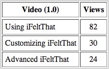
I’m keeping my sales numbers close to the vest (for now), so it’s difficult to place the above table into context. Let’s just say that I’m pleased enough by views of the basic video; but less so of the other two. I had higher expectations that watchers of the first video would be intrigued (or entertained) enough to look at the others. Was it possible to entice users to learn more of the depth of the program? Were they able to pick up sufficient user guidance from the short Help system snippets? Were the features and techniques discoverable on their own? Or did curiosity die at the opening screen and default settings?
As a glutton for further punishment, I recorded an entirely new set of videos for the 1.1 release of iFeltThat. Enough features had changed or been added to make the videos worthwhile — or so I deluded myself. In the interim, my video editing skills had improved a bit, allowing me to make the three videos a little more videographically interesting. I came up with a new set of snarky titles to keep the handful of fans amused. These videos weren’t J.J.Abrams productions, but then again, the budget was zero.
With 20 days into the availability of the new version and companion videos, here are the sad results:
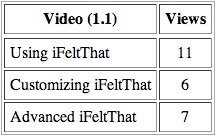
This includes, incidentally, a period containing a sales surge following a hefty earthquake event in the Los Angeles area and some other publicity bearing fruit (in the top 10 paid News apps for the past few days). I think it would have been faster for me to give live, personal demos to each viewer.
I’m getting the feeling that App Store app users aren’t big on support web sites or milking every ounce out of an app. When you spend weeks and months of your life developing, coddling, and promoting an application, it’s hard to remember that the bulk of your active users won’t be living and breathing your app all day every day as you do. They’ll use it for a minute or two here and there, and then move on to more important matters. If the developer has done a good job of entertaining or informing the user within the app, then the big reward is having that user come back to the app for a precious minute or two. In other words, you’ve got to put it all in the app. Anything outside of the app, such as the support web site, is for a tiny minority of users (who are, nevertheless, also your biggest fans).
It’s also true that as a developer, you must exercise extreme caution when judging new feature additions to existing products — to avoid feature-creeping an app into a useless jumble. So, while you should put it all in the app, don’t put it ALL in the app.
I’ll be trying additional communication avenues, including Twitter. Eventually, I’ll embed the ability to read app-specific tweets into the apps — although this could be done easily without Twitter, as well.
Will I do another set of videos for the next major release? I’m not sure at this point. The one selfish benefit to going through the exercise is that it hones your live demo skill...which comes in handy when hardly anyone watches the videos.
Wednesday, May 20, 2009